Backside beauties: Book focuses on automotive rear ends

What were your most memorable automotive backsides? For me, they included the eyebrows and cat’s-eye lamps of the 1959 Chevrolet Impala, the triple bulbs of the ’58 Impala, the sequential turn signals of the Mercury Cougar, the split-window ’63 Corvette, and the winged trio of the Bertone BAT concept cars.

But I’d also include the original Oldsmobile Aurora, those big vertical tail lamps on the early Volvo and Cadillac SUVs, and the original Porsche Cayenne, though not for the usual reasons. 

I traveled with the Porsche engineers on various development drives when the Cayenne was being tested, and one day in northern Canada one of those engineers was running his hand admiringly over the vehicle’s rear flanks. 

When I asked why, he said the car’s curves reminded him of the way his wife’s waistline curved in above her hips. 

As it turned out, this test drive on the other side of the world was taking place on his wedding anniversary.
Backside beauties: Book focuses on automotive rear endsBackside beauties: Book focuses on automotive rear ends
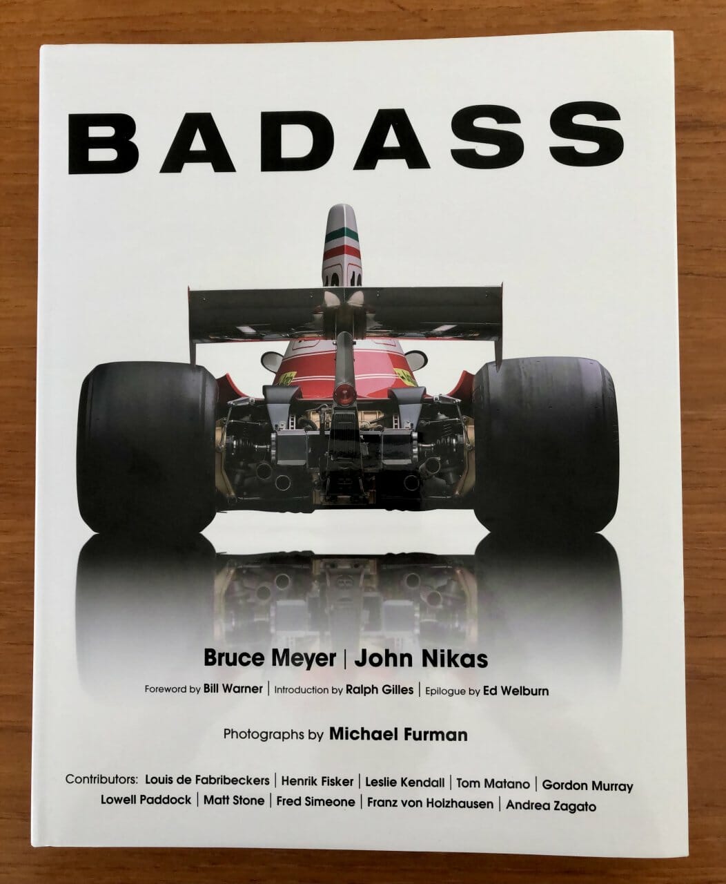
Book cover

This rush of nostalgia was triggered by Coachbuilt Press’s latest coffee table book, Badass.

Two years ago, Coachbuilt published The Face of Change: Portraits of Automotive Evolution, a book that, like the images displayed by photographer and publisher Michael Furman, focused on the front of various vehicles, with words about why the cars we see coming toward us look the way they do.

Not long after the book was published, Furman was at the annual car show at the Quail Lodge during Monterey Car Week and car collector Bruce Meyer suggested that a subsequent volume could focus on the other end of the vehicles. 

As it turned out, Furman and co-author John Nikas had been thinking along those same lines and thus Badass, which not only is a book about the backside of an automobile and why it looks like it does, but also is Meyer’s autobiography, in which he explains his childhood interest in cars — the Motorama shows were staged a mile from his Southern California home — and how he has become an advocate for preserving and restoring historic hot rods and racing cars.

Several others contributed stories to the book as well, including such designers as Tom Matano, Louis de Fabribeckers, Ralph Gilles, Franz von Holzhausen and Ed Wellburn; collector and museum owner Fred Simeone; concours founder Bill Warner; and historian Leslie Kendall.

Several note that we probably spend much more time looking at the backside of cars ahead of us in traffic jams than we do admiring the grille and headlamps in our rearview mirrors.

Unless they were rear-entrance vehicles, early motorcars had very plain rear ends, sometimes showing a spare tire or two or perhaps a rack for luggage. Nautical and aircraft shapes became popular, as did — briefly — the Continental kit, and — not so briefly — the spoiler. 

Some of the most spectacular rear ends are featured in a 13-page run of Furman photos under the “Future Tense” banner. Included are vehicles such as the 1935 Alfa Romeo 6C-2300 Aerospider, the1936 Bugatti Type 57G “Tank,” the 1936 Stout Scarab, the 1947 Cisitalia Aerodynamica, and the 1948 Tucker. 

Meyer remembers that “For most American cars in the 1950s, the rear end is where the action happened.” De Fabribeckers lists various requirements for front and side views, and notes that “the rear end exists in a different world (and designers are) freed of many of these constraints.” Zagato adds that while preserving clients’ brand identity up front, his family built its fame on its designs for the rear of the car. Von 

Holzhausen writes of a new challenge for designers — rear ends of electric cars with no tail pipes.

And Matano’s chapter on “Building the Perfect Butt” includes the story of taking his design team to a lingerie show to study “how the light falls on the curves of the body.” He also sends us to the dictionary to look up the meaning of the word “callipygian.”

Badass is a wonderful bookend to the Faces volume, and leaves us eager for whatever section of the automobile and its design Coachbuilt Press will explore next.

Reviewed

Badass

By Bruce Meyer and John Nikas, with photography by Michael Furman

Coachbuilt Press, 2021

ISBN: 978-1-7325017-3-7

Large format hard cover, 256 pages

$85

Let’s Dig Into The Design Of The New Nissan Z Proto

Illustration for article titled Lets Dig Into The Design Of The New Nissan Z Proto
Photo: Nissan

Nissan finally pulled out of its torpor and did something exciting that didn’t involve smuggling a disgraced CEO in a suitcase: they finally showed a new Z car. If Nissan still has an iconic car in its stable, it has to be the Z, which has been around in various forms since 1969. The new Z Proto is clearly heavily inspired by the original Z, but also shows some other crucial design approaches that I think are important even without the retro inspirations. Let’s dig in a bit.

Advertisement

Illustration for article titled Lets Dig Into The Design Of The New Nissan Z Proto
Photo: Nissan

The original Datsun Fairlady Z — the goofily charming name they called it in Japan that would never, ever have a chance here in these Very Insecure States of America — was designed by a team headed up by Yoshihiko Matsuo.

Advertisement

Matsuo designed a sports car that fit very well in with the sportscars of the era, with dramatic long, long hood/short deck proportions and flowing curves. It had a low, strikingly sloping greenhouse that merged the rear hatch area into the roof in almost one seamless line, and had a face of an aquatic beast with an open rectangular grille and recessed headlamps, sometimes plexi-covered.

It felt like a Jaguar E-Type, just a bit more restrained and practical. It really was an almost unobtainable sportscar that almost anyone could actually obtain—affordable, reliable, usable, but with that look that made you feel funny in your squishy parts.

The new Z Proto (it’s still based on the current 350Z deep down) very clearly looks to the original car for inspiration, mostly from the original 240Z, but also taking elements from later developments of the Z cars.

It’s sort of a retro design, but in the sense that it has a set of design characteristics it pulls from earlier designs; it feels like a newly designed car that is pulling and adapting very specific forms and details.

Advertisement

Specifically, I think these are those key forms and details:

Illustration for article titled Lets Dig Into The Design Of The New Nissan Z Proto
Graphic: Jason Torchinsky/Nissan

Advertisement

If we run down the list, we have:

1. A large, rectangular grille

2. That sort of Gothic arch-shaped hood bulge

3. That scalloped cutaway in front of the headlamp

4. The shape of the side windows

5. The round badge on the C-pillar triangle (and the whole shape of the pillar)

6. The near-unbroken roofline into rear deckline

7. That rear fender arch

Of these, so far the one I’ve noticed the most commentary on is that large rectangular grille. Personally, I kind of like it; the original had the same sort of grille, but it was bisected by a bumper blade, and sometimes just the upper section would be emphasized with chrome bars. You’d occasionally see the full unbroken grille on racing Z cars, though:

Illustration for article titled Lets Dig Into The Design Of The New Nissan Z Proto
Photo: Nissan/YouTube

Advertisement

The big rectangular grille has always been there, it’s just that Datsun attempted to hide or divide it more, at least on the road cars. That approach—dividing the grille with a bumper blade—could still work on the new design if people had an issue with the unbroken grille:

Illustration for article titled Lets Dig Into The Design Of The New Nissan Z Proto
Illustration: Jason Torchinsky/Nissan

Advertisement

Personally, I think Nissan should offer the dividing bumper blade as an option; then people who wanted to recall either the more refined look of the street cars or more the raw madness of the race cars could decide to put it on or not. Maybe it could even be easily removable and replaceable by the owner?

I’m looking at these and realizing I’m not entirely sold on the headlights, though. I think the appeal of the Z’s headlights has always been their deep-set quality and were at their best when covered with a plexi cover:

Illustration for article titled Lets Dig Into The Design Of The New Nissan Z Proto
Photo: JDM Parts

Advertisement

A modern take on this general shape, a more teardrop kind of design with more interior depth, I think may have worked better.

Design influences from later Z cars are present, too, as we can see here:

Illustration for article titled Lets Dig Into The Design Of The New Nissan Z Proto
Graphic: Nissan/Jason Torchinsky

Advertisement

The mostly vertical door handle is a pretty clear reference to the most recent 350Z car, since that was one of its most notable design details, at least from the side, and the taillights, set into that full-width black panel and illuminating from behind like some sort of digital display clearly references the 300ZX taillight setup, also flush-mounted into a black panel and having similar shapes.

I don’t mind this sort of mix-and-match approach. I think the 300ZX taillights were interesting, and this adaptation of them feels extremely modern.

Advertisement

The black top on the Z Proto reminds me of the vinyl tops you’d occasionally see on Z cars back in the day:

Advertisement

Vinyl tops are such an irretrievably dated look now that I can’t imagine that’s what they were going for, but it’s what I thought of immediately. That said, I think it does work on the car, emphasizing the triangular sail of the C-pillar and helping to mask the thickness of modern window pillars.

Aside from its interpretation of design cues from Zs past, I think the biggest thing the new Z Proto gets right is more about what it doesn’t do. It’s a surprisingly clean and restrained design overall, relying more on the overall lines and forms and less on body contours and character lines and creases and vents and folds and flaps to convey its concept of sportiness.

Advertisement

This is, of course, in very dramatic contrast to one of the Z’s competitors, the new Toyota Supra. Here, look at the cars side by side:

Illustration for article titled Lets Dig Into The Design Of The New Nissan Z Proto
Graphic: Toyota/Nissan

Advertisement

Next to one another, it’s hard not to see the Supra as an absolute brawl of forms and shapes and panels and bulges and gaps and vents and mouths and gills and eyes and on and on. It’s almost monstrous if I’m honest.

Compared to the clean, smooth forms of the Z, I think the Supra feels like a biological, bloated mess. It’s too much, and it doesn’t have to be that way to convey power and speed and fun, and I think the Z is a great example of that.

Advertisement

I think Nissan did a good job here, and with just a few minor tweaks, this could be a fantastic car to remind people that Nissan is still around. I hope they can pull it off.

For GREAT deals on a new or used Chrysler, Dodge, Jeep or RAM check out Monrovia CDJR TODAY!